
More often than not (and i blame the eyes as highly adaptive part of the body that could differentiate all shades and hues of colors) that the picture you take do not turn out to be exactly how your eyes see it.
Frustrating? I've been there.
Blaming the gear? Always.
Need flash? Perhaps.
I chance upon some funny looking cap that does wonder to your photos by replacing the traditional white balance card or 18% grey card.
Don't ask me why a white balance card is 18% grey but that is not the point of this blog entry here today.
I've also read that coffee filter gives you almost the same effect, as the paper isn't 100% white but 18% grey.
For me, the white balance adjustment via this method might not be accurate; but it is better than nothing at all.
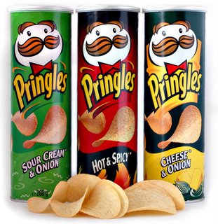
After some reading up and experimenting, i've sort of decided that the (most debated and some say foolish) one DIY way that cost you nothing is using a cap/lid from the Pringles bottle.
Yeap. Pringles.
OK. Not entirely free, but it will cost you maybe RM4.30 or slightly less than USD1.50. Now compared to the solution you get by buying these almost similiar lens cap that range from RM30 to RM300 (Cheap lens cap that has opaque white cover to the more expensive Expodisc)
Maybe they are more accurate in many sense, but i am not ready to spend RM30 or RM300 to find out.

18% Grey? Can la!
On my Nikon D90, there is an allocation for PREset white balance (Pre WB). Infact on D90, i can store up to 5 PRE WB (Pre-0 to Pre-4). The process is as simple as pressing the WB button, selecting the WB until PRE. Then press WB again until PRE blinks. Put the Pringles lid infront of the lense and snap a photo at the direction you want to calibrate the WB. Press the shutter or WB again and you are set.
Now, what i did to the pictures below was that i did the calibration ONCE. I started with calibrating the home's hall and the lightings.
My home is fixed with energy saving warm yellow lights all over and they wreck all the object (and subject) color on the camera. Everything comes out too warm and the color just went dead and dull.
So, without anymore delay, here are some sample comparison photos using the camera AWB and Pringles cap. You be the judge.


From this first two comparison, you can almost see what i meant by the lights wrecking havoc to the color of all objects in the hall. Noticed the yellow color of the box on the bottom left corner where it showed up as YELLOW in the corrected WB with Pringles cap as compared to washed out yellow and almost blended with the sofa?
How about the cloth pegs next to the tv on top of the dvd player? Bet you did not know it was blue in the first photo.
Here is one more comparison i took of wifey's iPhone left lying on the dinner cum utility table.


Now, don't you think that a white cover should stay as WHITE and not white with tinge of yellow? Even the flower motifs came to life. At least it justified the purchase (Thank You Sister In Law for getting it for Wifey from Bangkok!).
Be reminded that the photos i took were not manipulated with any post processing or having them adjusted in anyway. I took all photos in the same setting so that everything remain as constant except the white balance.
Here is one more example of the Pringles WB at work.

Now, this is a different approach. I know some of you might say that "why so much trouble, photoshopping the photo will do wonder and save the image above" or "why bother, just shoot in RAW where everything could be corrected".
They were right. But digital darkroom has it's limitation as well. One of them being TIME. If you snapped 1000 photos for, say, a wedding and each and everyone of them needs you to adjust the WB manually in photoshop...do you think you will die of boredom adjusting each and everyone of them?
I know i will. In fact, the biggest motivation for me to use this method of WB was to save me more time!
FYI, i do not use photoshop (as in the legal Adobe Photoshop or CS3 or CS4) but i use an open-source imagine manipulating program similiar to photoshop - but there is a lot of learning one has to do as well, it's open-source and not as user friendly.
Check GIMP or Gnu Image Manipulation Program out here. It is free but you have to re-learn if you are used to PS or CS. Most items are similiar between GIMP and PS/CS, but some are not the same or as easy to do, like vignette (see last portion for sample).
Continuing on from the image above, see what GIMP failed to save for this photo where i ran an auto-correction for WB and manually adjust the level to try to "save" the pic.

Yeap. I might as well throw the camera away.
And here is how it looked using the calibrated WB.
 The color of the cover pops out (it's velvety green with floral motifs and not yellow/gold with confused floral motifs as above) and my sofa which should be brown, showed up as brown and not yellow. I admit that i should had set the shutter to be slower maybe to 1/13 to allow for more lights to come in, but that will then skew this experiment. So, if i want to "save" this photo (if my life depends on it), i can bet that GIMP will allows me to do it by a few simple adjustment.
Here is one last comparison before i call it a night for today.
Nadia's MaryJane that her Auntie Audrey (yeap, my sister in law that went to Bangkok) gave.

 Whole load of differences ain't it? And just for comparison sake, the photo below were after i adjusted the level WITHOUT touching the auto WB correction in GIMP


And here is how it looked using the calibrated WB.

Here is one last comparison before i call it a night for today.
Nadia's MaryJane that her Auntie Audrey (yeap, my sister in law that went to Bangkok) gave.


And just to demonstrate how easy it is to make the photo look a bit better by saturating the contrasting color, here is my attempt at using GIMP to bring it out to life.

This photo above were corrected using the Pringles cap as the base photo and i just played with the contrast and level to obtain saturated color like above. The color is now see as how my eyes sees them. Blue is blue. Pink is pink. White is white and my hard wood flooring, the way it was intended to look. (ok, my vignetting skills sucks, i am learning and i promise to make my photos better!)
So, here you go, a RM4.30 solution that you get to enjoy eating (the Pringles potato crisps) and at the same time, save the environment by re-using the plastic lid for something as useful as this!
excellent stuff... got a 1 million question for you. how do you stick the cap on your flash ah?
ReplyDeletedouble sided tape? :)
got a pic of how it will look like?
Flash cap? The diffuser you meant? Which one? The mee in my mug (otherwise known as lambency diff or apek calls them lampachi diff) or the flash diff cap specific to your 580EX? If the latter, should be pnp...else...velcro?
ReplyDeletesorry bro, my confusion, I thought you just stick the Pringles cap on the normal flash. Didnt know you are using the maggi mug LoL
ReplyDeleteSorry i also confused ppl.
ReplyDeleteThe pringles cap is put/placed at the lens and you take a pic according to how you set custom WB on your camera. Then use that "calibrated WB" as your WB.
when i see you, bring camera so i can show you what i meant.
but... i love warm colours!!
ReplyDeleteMind sharing & taking a pix of how you placed the cap at the lens and post it on your blog.
ReplyDeleteI too thought you place it over the flash to diffuse it. Thanks
Here. A more photo-centric guide to calibrated custom white balance : http://opstupe.blogspot.com/2010/03/custom-wb.html
ReplyDeletethis is so useful new tips for me!
ReplyDeletethanks 4 sharing stupe
Muchas Gracias,
ReplyDeleteGran idea
Thanks a lot,
This is really a great idea, and also a good saving for my pocket.
I used a transparent cap from a 1 liter pot of yoghurt, te result is awesome.
Vindemiatrix